View
project
Case study

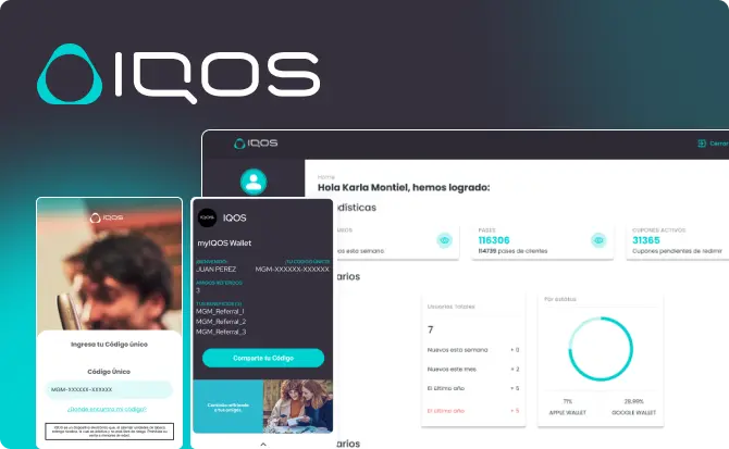
Electronic cigarette virtual card

Get benefits and rewards by sharing the referral code quickly and easily to new members of the virtual card.

logo figma

The challenge

Carry out the design and development of a digital card, in which users can share their referral code, add them to their wallets and obtain different benefits.

The methodology

To carry out the design and development of the virtual card, a specialized methodology was implemented, which consisted of conducting prior research and extracting insights, with the aim of creating a user-based solution.

01
Image Lupa
Analysis of the requirements.
02
Image panel
Research findings.
03
eye image
UI discovery and design.
04
discover image
Development and QA.
01
Image Lupa
This is some text inside of a div block.
02
Image panel
This is some text inside of a div block.
03
eye image
This is some text inside of a div block.
04
discover image
This is some text inside of a div block.

Results

The virtual card allows users to share their referral codes quickly and easily to new members, as well as obtain rewards for doing so.

Logo refresh

• An important note was added to let users know that the sale of the product is prohibited for minors.

• Once the session has started, a button large enough was added so that the user can quickly find where to share the referral code.

Brand Book

Our proposals

• An important note was added to let users know that the sale of the product is prohibited for minors.

• Once the session has started, a button large enough was added so that the user can quickly find where to share the referral code.

Our proposals

• An important note was added to let users know that the sale of the product is prohibited for minors.

• Once the session has started, a button large enough was added so that the user can quickly find where to share the referral code.

Our proposals

• An important note was added to let users know that the sale of the product is prohibited for minors.

• Once the session has started, a button large enough was added so that the user can quickly find where to share the referral code.

Our proposals

• An important note was added to let users know that the sale of the product is prohibited for minors.

• Once the session has started, a button large enough was added so that the user can quickly find where to share the referral code.

Our proposals

• An important note was added to let users know that the sale of the product is prohibited for minors.

• Once the session has started, a button large enough was added so that the user can quickly find where to share the referral code.

Our proposals

Our proposals

Our proposals

Our proposals

Our proposals